It used to be that if you had an online business, your website was the equivalent of a shopping window. Now, this holds even true if you have a brick-and-mortar store.
You probably heard about the 80/20 rule or Pareto principle before. And just like in a physical store, not all are created equal. Some shelves, or in our case pages, are more critical than others. 20% of your efforts will bring in the results, while 80% are just there for filler or, worse, as a distraction to your readers.
So how do you apply this to your website? Which pages are more important than others? And to which pages should you pay the MOST attention to get the quickest and best results for your business?
Before we look at the individual pages, let’s first get yourself in the proper mindset to test and evaluate the current content on these pages and make you understand how you can improve them.
Table of Contents
Two questions to ask when optimizing your website for your visitors
It is easy to overlook the bigger picture when optimizing something for a particular goal. You might forget the most important thing by ignoring the bigger picture and just trying to focus on one item (like SEO).
First and foremost, a site must be optimized for the visitorClick To TweetIf you want to optimize your website for the visitor, there are two questions you need to focus on.
Question #1: What is the visitor looking for?
By default, almost all the visitors to any page on your website go there because they are looking for a specific something. It might be an interesting article they saw linking to your site, an email, a post on social media, or a Google search result when they were searching for something related to your business.
Unless someone clicked a wrong link and ended on your website, the visitor is looking for something. So what are they looking for? Why did they end up on your site?
Where did they come from? If you want to give a helpful and valuable answer to your visitor for this question, you first need to understand how they ended up on your site in the first place. If you know where someone comes from, you’re already halfway there to help understand what they are looking for.
Did they end up on your website via a search engine? (and if so, what is the search term they used?) Did they end up on your site via social media? (and if so, who shared certain content and with which context?) Did they end up on your website via an email (and if so, which campaign?) Or maybe even just from an internal link, and what page were they on before?
If you know where a visitor came from, it makes it easier to assess what information they want to know. Any page on your website can bring in a tremendous amount of information to the reader, but you don’t want to overwhelm them. You want your visitor to get to know something so they might take action with you based on what they learned.
Less is more.
The more different types of information you’re serving to your visitors, the less likely it will be for them to remember it. Or they might run away because they can’t find the specifics they are looking for.
Now that we know what your visitor is looking for on a page they land on, it’s time to move on to the next question.
Question #2: What is my (business) goal for this visitor?
When your visitor is served with the information they were looking for, they are ready to give something back to you potentially. It’s time for you to ask something of them. We know “sales” is a scary word, but in any shape, way, or form, a business needs to get leads, which might turn into sales at the end of the day to be able to survive.
One of the most critical components of any page on your website is the Call-To-Action (CTA). This is one of the places where most businesses fail. If there is no CTA on your pages, how can you ever convert visitors into customers? As a general rule of thumb for your website, you will need at least one CTA per page.
The goal of your home page isn’t for people to see your nice and shiny logo and move away again. It is for them to get a first glimpse at your business and find out all about you what they can.
The goal of your product page isn’t for people to get some specifications and leave. It is for them to figure out if this is the product that will solve their needs and buy it from you.
The goal of your Content Marketing isn’t for people to consume content. It is for building brand awareness and expert status in your niche.
Every page on your website should have a goal. When people consume your content, they get better informed, and it requires a response when they get better informed. What is that reaction of the visitor going to be? What do you or your company want to get from each visit to your pages?
We can start moving on to the next phase only when you know the answer to the above two questions.
What are the most critical pages on your (small) business website?
Looking at the pages of your website, which ones are the MOST important? Which ones can drastically improve your business results when optimized correctly? Every website and every company is different, of course, but here are the nine most important (and generally speaking, most-visited) pages on any site:
#1 – Homepage
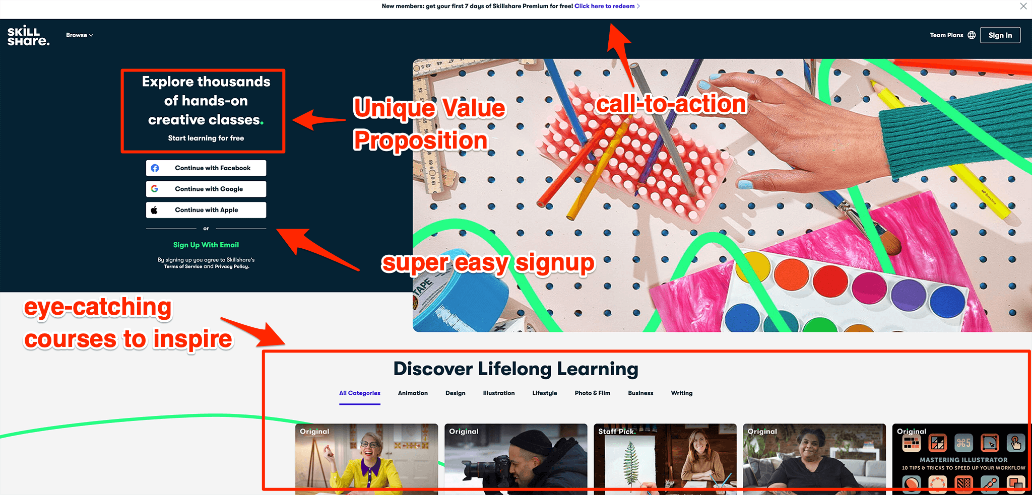
Your website’s homepage or front page is probably the most obvious one on the list to start with. And you can probably already guess why this is. Your website’s homepage is often the first impression someone will have with your company online. Visitors will stay on this page for only a few seconds before deciding whether to keep a bit longer and move over to other pages or leave your website again.
This means that if you make a wrong impression, your engagement with a potential customer can quickly end prematurely. Next, it is also the first and most important page for search engines to help understand the purpose and function of your site.
And, finally, according to the Zero Moment of Truth (ZMOT), yeah, sure, people come to dedicated landing pages to make purchases. etc., but consumers most of the time do something very interesting. They see an interesting product or offer on a dedicated landing page that you’ve set up for your ads, but before they buy, they go up with their mouse, click the home button and check out the homepage.
They want to see what your brand is all about. So the interesting thing about homepages and what comes from this ZMOT study is that while your home page might not be closing sales directly for you because that is likely happening on dedicated landing pages, your homepage can absolutely lose sales for you. And if you don’t optimize your homepage, there might actually be a high chance that your homepage is costing you money at the moment.
So how can you optimize this page?
Include a strong value proposition above the fold on your homepage together with strong design elements. It could be a visually appealing photo, an interactive animation, or just your brand colors in a way that works great together with your copy. Your goal here is to grab the visitors’ attention and explain the purpose of the website, of your company, and the values of your brand.
That is a lot to do in so little space. So be sure to adhere to the less is more rule from above.
The focus here is to make your visitors feel welcome and to create an immediate positive feeling with your brand.
On top of that, from a search engine optimization perspective, your homepage is probably also the web page that gets the most backlinks. This means you want to pass some of the link value from your home page onto internal pages.
This is often referred to as “link juice.”

Building those internal links from the home pages on your website lets the “link juice” flow to page 1, page 2, etc., helping them rank higher on the Search Engine Results Page (SERP).
The more tightly-knit your entire website structure (by using internal linking), the better the overall site will perform in search. Think of Wikipedia, for example; you know you easily get lost for hours as you stumble from one piece of content to the next.
So don’t forget to include precise navigation to let your visitor move further along your website to your other most important pages.
The question to ask yourself is: How are you making your visitors and potential customers feel when they first see your website.
#2 – About Us page
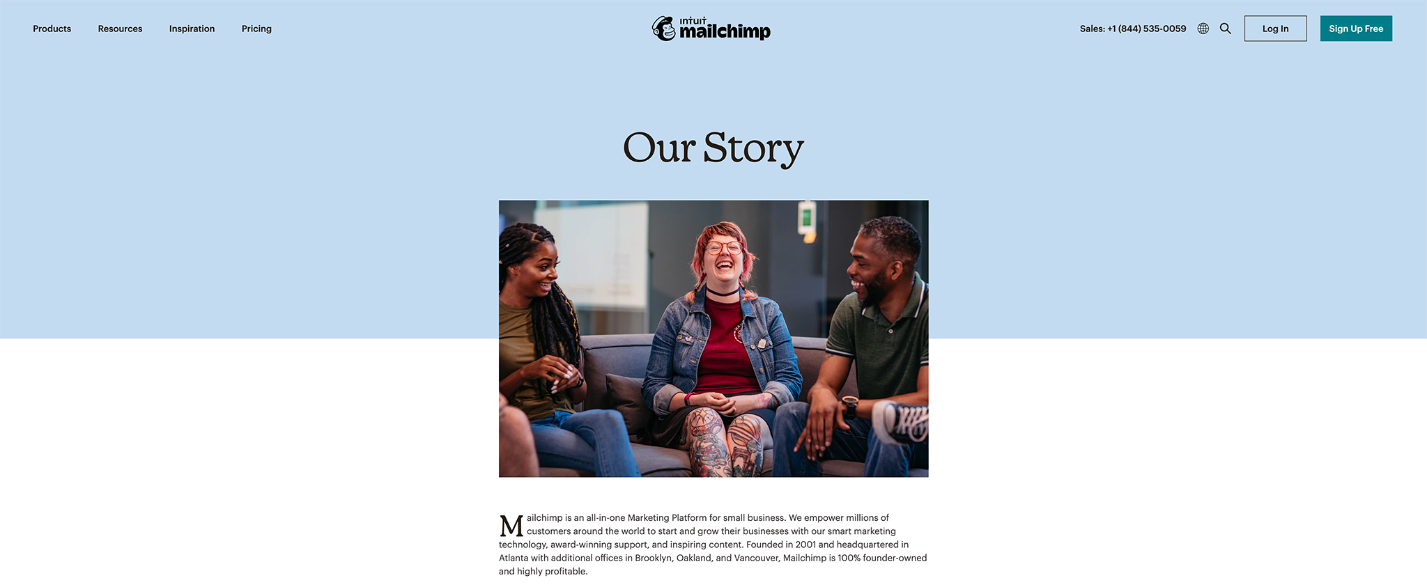
After the homepage, when a visitor already has some preliminary understanding of your brand and website, they visit the “About Us” page most frequently.
It is crucial because, for many people, this is the second page they visit most of the time. The page where they will learn more about your products and services and where you can build trust for your company. What is it exactly that you’re doing?
The “About Us” page isn’t just about delivering more information. It is about engaging with your visitors on a deeper level. For many people doing business on the web can feel impersonal, but it doesn’t have to be.
Don’t waste your visitors’ time with more words about your commitment to quality, empty words that serve no purpose and will drive your visitors away. Content such as a short video straight from the heart of you, the founder, or some funny homemade animated gifs can make everything much more personal.
So how can you optimize your About page?
When you write your “About Us” page, go back to that first question. What does a visitor want to know? They want to know your:
- Your values – does your way of thinking aligns with theirs?
- Your credibility – do you have relevant experience and proven success?
- Who you REALLY are – is there a real person behind the website, a person they can relate to and trust?
The question to ask yourself is: How are you using your “About Us” page to convince people with your brand story?
#3 – Blog
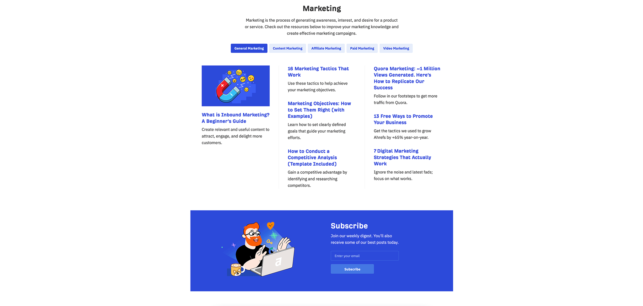
We already know about the importance of fresh content on your website. Blogging is how (small) business owners can distinguish themselves as a thought leader in their field.
Doing content marketing and having a blog on your website helps with four essential pillars:
- Search results. Search engines love fresh content. The more regularly you update the content on your site, the more preference they give to you. While the Home Page and the “About Us” page are primarily static pages, your blog page is the space on your website that can frequently be updated. Creating content also helps generate backlinks by people linking to your content from their site, which again helps with search ranking.
- Engagement on your site. Of course, you want people to spend longer and more time on your site. If not much is found on your site, it is difficult for them to warrant an extended stay. When you keep adding more and more content, you’re creating an extensive library of information your visitors can read and dive into. The longer a reader spends on your site, the greater the chances of them starting to trust your brand, the bigger the chances of them starting to engage, and as a result, the more likely they are ready to start buying from you.
- Relevant visitors. Just creating content for the sake of content creation is never a good thing, of course. You need to tailor your content to a particular Buyer Persona. So when you create content around topics that are in line with your business and the problems you’re trying to solve with your product or services, you will start attracting better-targeted visitors. You begin to get traffic from people who are your ideal customers.
- Reputation. Sharing your expertise with the world helps build trust. Over time, you become known as someone who offers value and can help their market.
So how can you optimize your blog page?
What you want from people consuming your content are engagement and exposure. Make sure to include sharing buttons next to your blog posts and a great CTA related to the topic that you’re writing about.
This can be a related email course or white paper you created for which people need to opt-in. Or just request them to leave their email address to be kept informed when new content is published.
The question to ask yourself is: Is the content I’m creating relevant for my target audience, and is it helping them solve their problems?
#4 – Contact Us page
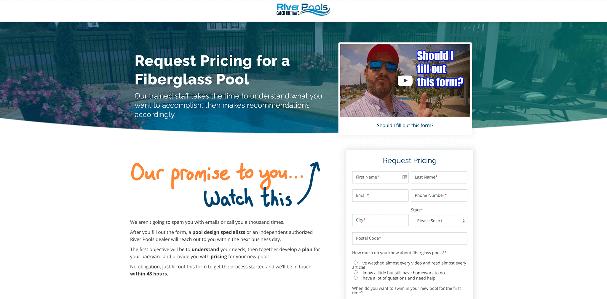
Having all the previous pages improved, delivering great information to your visitors is excellent. Still, you’ll lose some potentially new business if they want to contact you after visiting those pages and can’t.
Potential buyers want to know how they can reach you and don’t want to search for it.
You need to provide them with that information.
The “Contact Us” page of any website contains some of the most valuable information on your website and helps get people over the edge by building that last piece of trust. The easier you make this for your visitors, the more trustworthy it will be. After all, if I can quickly contact your company, I know you’ve got my back if something goes wrong.
An easy-to-locate contact page shows visitors that you’re open to communicating and meeting new clients.
So how can you optimize your “Contact Us” page?
Your “Contact Us” page is more than just a way for people to contact you or display your opening hours. It would help if you encouraged your visitors to communicate with you about ANYTHING.
Put all the necessary contact details above the fold:
- including your mailing address;
- if you are open to receiving people, you can include your business hours or any other relevant information like
- phone numbers,
- email addresses to reach the individual department heads,
- etc.
Don’t also forget to include testimonials to help build more trust. Add a personal element to your copy, etc., etc. It’s okay if you only prefer to get contacted by your contact form. But if possible, always try to include multiple options, like adding a phone number or an instant chat window.
The question to ask yourself is: What information can I add to my contact page that encourages visitors on my site to get in touch and start a conversation with me?
Over time, your website will grow bigger and bigger. New products are being launched; new content is being written. As a result, sometimes, it might not be the easiest for people to find exactly what they are looking for.
#5 – Search Results page
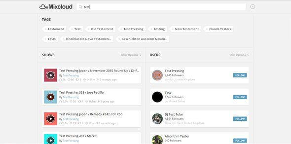
Does your website have a search function? If not, you should be looking into adding this. Because if people can’t find what they are looking for, they might be gone forever. Having a good search function might sometimes be better than the best navigation.
So how can you optimize your “Search Results” page?
Too many result pages are terribly designed and often overlooked. Ensuring that the returned results are the right for someone’s search query, for starters, make the result page clean and easy to navigate. Maybe add some related items to the search result as well and not only answer the direct question people are having.
People arrive on that page because they are eager to learn more, but they can’t find what they are looking for. Make it clean and easy to navigate.
The question to ask yourself is: Is the information displayed on my search results page attractive enough and easy to navigate to end up with the content I was searching for?
#6 – “Competitor alternative” pages
No matter which industry or product you’re trying to sell online, there’s always a bunch of people who are unhappy with the status quo and looking to compare their current solutions to alternatives.
One easy trick to get people to try and end up with your solution is creating comparison pages where you target the “[your competitor name] + alternative” search term. For example, MailerLite has a “MailChimp alternative” page ranking on the first page of Google.
Even if the search volume for pages like these isn’t very high, it is one of the best terms to start ranking your website for because anyone that searches for any of these terms has an intent to purchase. So even though there might not be a lot of visitors coming to any of these pages on your site, the likelihood that one of them is converting is much higher than any of your blog posts with lots of visitors per month.
Don’t just create one page for all your competitors, though. Create a single page for each of your competitors. Look at your competitors’ online reviews, see what customers are complaining about, and use those exact words in your copy to explain to the visitors that you have THE solution for them.
A great example of this is Podia. If you search for “site: podia.com inurl:alternative” you can easily see all the pages that they created around their competitors.
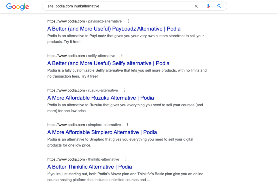
If you look closely enough, you can see that they created a simple template for all their competitors that allows them to create a new competitor page the moment some new competitor arrives. Looking at their page titles, you can also clearly see the antidote to their competitor’s pain that they are trying to address. Not all competitor is the same, they know this, and they know that for one alternative, price is an alternative; for another, storage limits is an alternative, etc.
Even the testimonials on the page are tailored to that specific competitor, for example, this one on their Gumroad alternative page:

The question to ask yourself is: What are my competitors, what problems are their users facing when using their product, and how can you be the solution to fix those pains for them. Then create a “[your competitor name] + alternative” template and fill in the blanks for all your competitors to start ranking for these highly profitable keywords.
#7 – 404 Error or “Page not found” Page
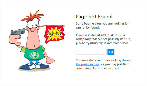
The one page that hopefully nobody ever ends upon. The 404 error page. The most underrated page on any website.
You might think we’re crazy, but everyone knows how frustrating it can be to end up on that dreadful error page after clicking on some links on a website. “You appear to be looking for a page that does not exist.” And immediately, you feel like an idiot. It causes someone to leave your site.
Regardless of how careful you are, how simple your site is, or how savvy your customers are, there is always a probability that people will land on this page. Nobody wants to lose out on a potential sale for any business, big or small, because of a 404 error. You can, however, optimize the negative experience people might encounter on that page and turn that potential leave into a win for your organization.
So how can you optimize your “404 Error” page?
- Make it more personal. Instead of presenting a boring, very technical page. Why not turn this page into a smile on the visitor’s face? Try adding a little bit of compassion or a bit of humor? By making it more personal, you can show that you feel the visitor’s pain and help them.
- Highlight your contact information. Either there is a mistake somewhere on your website (maybe a broken link), or the visitor made a mistake. Either way, the best way for most people to help them solve their problems is to give options to talk to another human being who can assist them. By including your contact information, you can show that you feel their pain and are there to solve the issue.
- Guide them towards the most viewed pages on your site. Often, this might be the thing they were looking for. A simple list of your favorite pages can already help a lot too.
- Add a search bar, containing a pre-populated search term based on the URL that led to this 404 page, so they can still quickly find the correct page
The question to ask yourself is: How can I deliver some happiness to someone who ended up on the dreaded error page? How can I still give value to them and not make them leave with a bad feeling?
#8 – Frequently Asked Questions or FAQ Page
The Frequently Asked Questions (FAQ) page is the spot on your website where you can answer the most asked questions about your product or service. However, having a separate page for it might not always be needed. For example, when you’re offering multiple different products or services, it might be better to incorporate this content on each individual product or service page.
If you offer just one straightforward product, however, you can quickly put this on a separate page and have that page start ranking for all the questions your (potential) customers might have.
Having a page like this will save you time, as you don’t have to answer those same questions repeatedly.
Don’t forget to include a call-to-action (CTA) with each answer, so you can persuade a potential buyer to take the next step and buy whatever it is you’re selling. After all, answering questions like these can remove any doubt that a customer might have so that they feel safe enough to purchase from you.
The question to ask yourself is: What questions do you get over and over in your support? What questions are people sending in via your company chat? Determine what questions people have that prevent them from making a purchase decision. Once identified, put them on your website and answer them clearly and concisely.
#9 – Testimonials/Review page
Just like the FAQ page, a testimonial or review page isn’t 100% necessary to warrant a separate page, as. you should include testimonials and reviews throughout your website to show social proof and convince customers that whatever it is you sell should be bought from you.
But on a dedicated testimonial page, you can go further than just one or two-line reviews. Write complete case studies showcasing the long-term results people get from using your product or service. Maybe even include video testimonials to make them more engaging.
However, if you choose to display testimonials of customers, make sure at a minimum to try to include:
- the full name of the person that left the review
- a photo of the person that left the review
- contact info (a link to their social media account or company website)
- optional their job title
- optional a link to a third-party place online where the review was created (G2, Trustpilot, or Google Business Profiles, etc.)
Adding these will add authenticity to each of the testimonials. After all, anyone can create a review, but by adding these items, the review looks more real and can be traced back to an actual credible source that establishes trust.
The question to ask yourself is: How can you get customers to leave you reviews on the platforms of your choice, be it Google My Business (or Google Business Profile as it is now called), Trustpilot, or any other place. Encourage your customers to leave reviews so you can embed them on your website and help convince wandering visitors to turn into buyers.
So there you have it, the nine most essential pages on any website and how you can optimize them for instant success. This list, however, is not conclusive; it is a general list for all websites. However, at your company, individual pages could be of equal importance.
Look at your most visited pages, figure out why people are visiting those, give them what they want, and ask them for action in return.
One final piece of advice: don’t think your work is done after optimizing these pages. The world is continuously evolving, and your most popular pages today might not be that popular anymore in a couple of months.
Like with every piece of online marketing, you can test, learn, keep improving, and make adjustments.
